
As an exciting start to a brand-new year, we are thrilled to announce that Neighbourhood Watch has refreshed our branding.
![]() We have adopted a new logo, termed the ‘today’ logo as an alternative to our ‘traditional’ logo, which was refreshed in 2017. This means we support two logos from 2023, and our members and support can choose to use either one.
We have adopted a new logo, termed the ‘today’ logo as an alternative to our ‘traditional’ logo, which was refreshed in 2017. This means we support two logos from 2023, and our members and support can choose to use either one.
Both logos have the same recognisable yellow roundel, proudly displaying our name Neighbourhood Watch. This has been untouched to ensure we retain our incredible 95% brand recognition across England and Wales.
The difference between the two logos is in what is displayed inside the yellow roundel. Our ‘traditional’ logo shows the fantastic relationship between the police and the community, which in some areas, Neighbourhood Watch groups are central to enhancing this special relationship. The retro figures hint at the longevity of Neighbourhood Watch – which has been established within communities for over 40 years. Some areas may prefer to continue to use this logo as it best represents their group.
Our ‘today’ logo was born out of overwhelmingly positive feedback from our temporary 40th-anniversary logo launched in 2022 for that year only. It shows three figures in our refreshed core colours and represents a celebration of diversity. Since we began in 1982, communities across England and Wales have changed and will continue to do so. No matter what the makeup of our communities is, we strive to be embedded within them all and nurture the incredible strength and uniqueness of each one.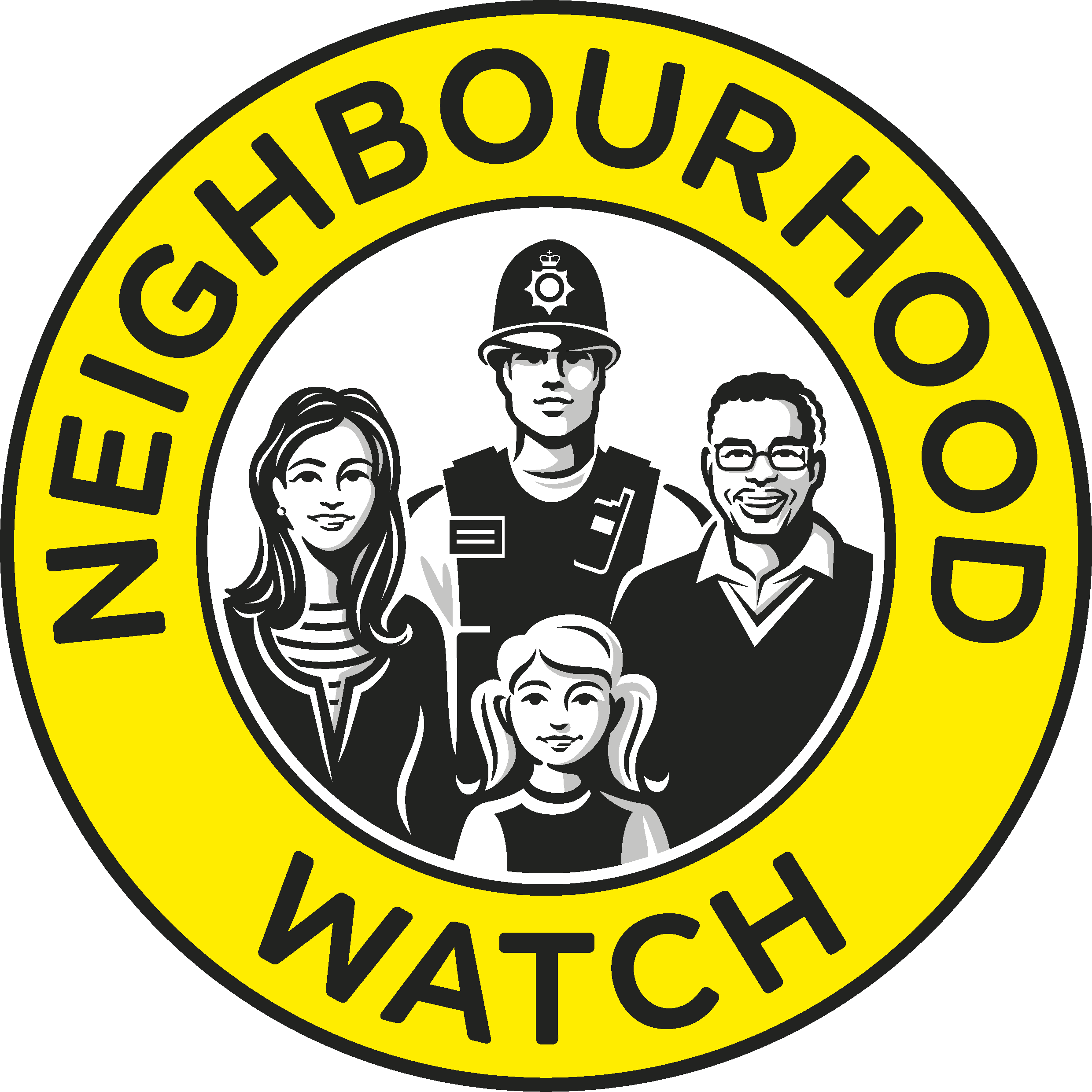
Forty years ago, Neighbourhood Watches were restricted to the street in which you live. Today Neighbourhood Watch groups can be set up to cover whole villages or towns, social media groups, or other types of communities such as sports, corporate, or faith groups. The teal banner within our new today logo represents our longevity and relevancy amongst communities from 1982 through to today.
John Hayward-Cripps, CEO of Neighbourhood Watch said: “Both sets of logos represent togetherness – a key strength of Neighbourhood Watch. No matter which logo you choose to use, together, we are making this a better place to live.”
In addition to our new logo, we have officially adopted a teal colour (introduced in 2021) which compliments our existing colour palette of yellow, black, and grey and softens our overall tone. As a friendly charity, the softer teal colour also brings a sense of warmth and welcomeness which reflects the values of so many of our Coordinators. This friendliness is further reflected in our new Communication Guidelines, which have been introduced to support our volunteers across the country to speak as one voice. These guidelines capture our personality, attitude, and opinions and help us to connect with people. It sets our intentions: this is what we’re like. And this is how we want the world to see and feel us.
To bring this all together, our Brand Guidelines have been refreshed to support our volunteers and partners through our brand refresh - including our story, our values, how we communicate, our visual identity, our logo journey, and our brand in print.
|
Download our logos, Brand Guidelines and Communication Guidelines here |